

On the previous article of this section, we described how to perform a first customization on a LED widget on our nice Emoncms visualization interface. Now it’s time to go on and teach you some further hints, which aim is to introduce you how you can yourself peep inside the code to modify the elements according to your needs.
So this time we are going to customize the so called “containers”
Containers
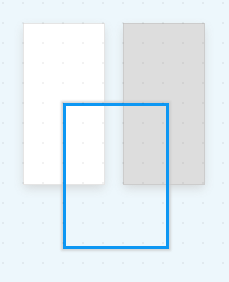
If you need to draw a layout of the page in order to organize widgets according a common field of application, you need to use containers. Containers are just a graphical support consisting in a squared coloured background or a squared coloured border. By default only white and gray backgrounds or a blue line border are available.
Let’s see an example of how different colours can be used to organize and improve the view, before entering into the coding details.
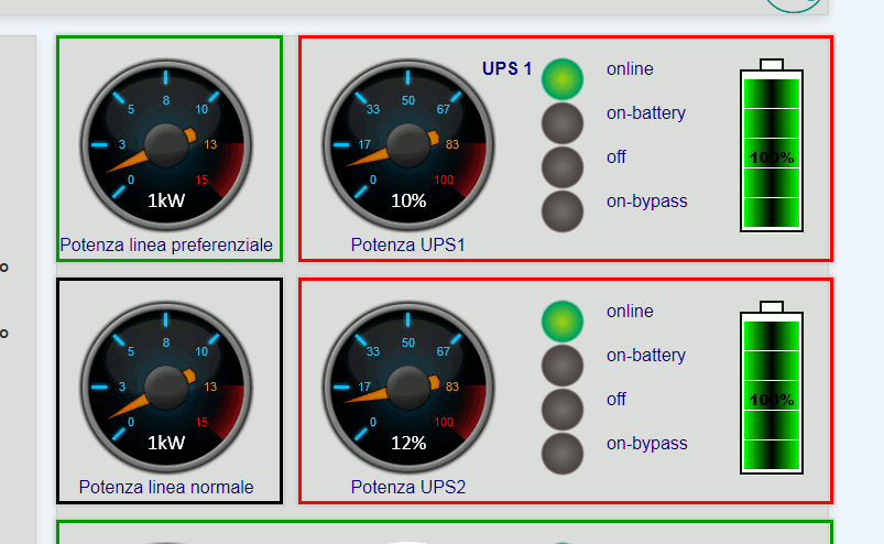
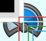
In the above example (fig. 1) different colour borders have been used to define at first glance different scopes. A red border refers to UPS power lines, a green border refers to motor generator power line, and a black one refers to main grid supply.
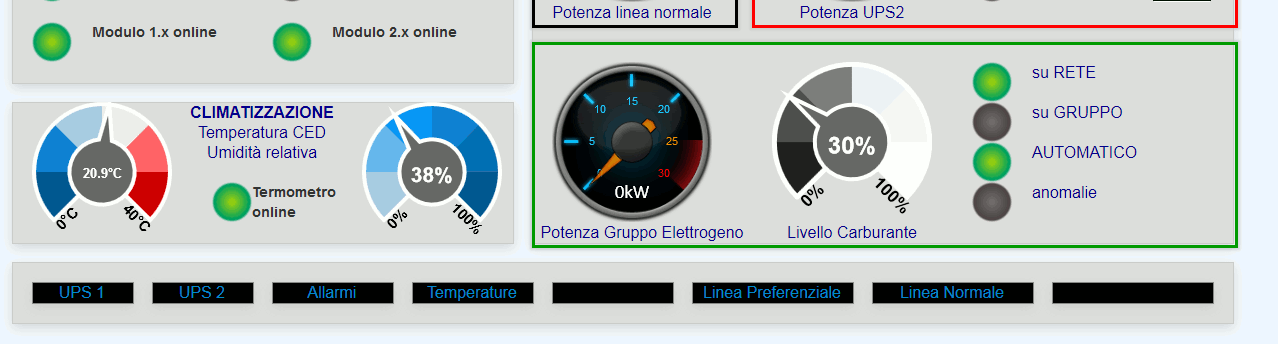
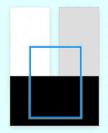
In the above figure (fig. 2) gray background squares have been used to gather widgets of the same field of interactions. While black background squares have been used to create a sort of footer menu to navigate into detail pages.
So it’s time see how we can customize emoncms containers to fit our needs.
How to:
First of all, we again remind you to make a backup of your existing configuration or to work on a test environment till you get familiar with the following steps. What we are doing is really easily affordable by anyone with just the basic knowledge of coding.
Once backup is done or test environment available, we should get access to the webserver folder. Depending on your environment and preferences (we are using Debian, and it’s under /var/www/ ) you’ll have an emoncms folder containing multiple folders and files. We should go into ./emoncms/Modules/dashboard/Views/js/ once there you can list the content and you’ll find a file named widget.css and anoter named widgetlist.js
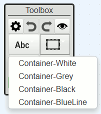
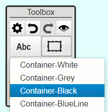
3: Default menu
4: Default containers
The first of the two files defines the graphical aspects of the containers, the latter is necessary to provide the visualization on the drop down list (fig. 3). We can see below the content of our interest in those files.
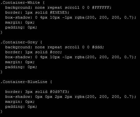
5: widget.css
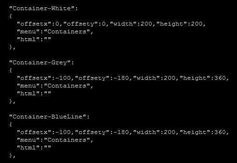
6: widgetlist.js
Probably you have already guessed what we are going to do now. We would like to add a Container-Black container. So we edit the file wideget.css with our favourite editor (we use vi) and we create a new section:
.Container-Black {
background: none repeat scroll 0 0 #000;
border: 1px solid #888;
box-shadow: 0 4px 10px -1px rgba(200, 200, 200, 0.7);
margin: 0px;
padding: 0px;
}
Colors are in the usual hex rgb scheme (#rrggbb rgb to hex – shorten version in this case #rgb). Then we need to edit the widgetlist.js to add the newly created container just after the Container-Grey item.
"Container-Black":
{
"offsetx":-100,"offsety":-180,"width":200,"height":360,
"menu":"Containers",
"html":""
},
Mind the “,” at the end of the last line!
If everything went fine we can now see the Container-Black on our editing menu and add it to our Dashboard.
After creating a solid container, we are goingto show you how to create also a coloured border container. So let’s go back to our widget.css and add the following lines after the “Container-BlueLine“
.Container-BlackLine {

border: 3px solid #000000;
box-shadow: 0px 0px 2px 2px rgba(200, 200, 200, 0.7);
margin: 0px;
padding: 0px;
}

.Container-WhiteLine {

border: 3px solid #ffffff;
box-shadow: 0px 0px 2px 2px rgba(200, 200, 200, 0.7);
margin: 0px;
padding: 0px;
}

.Container-GreenLine {

border: 3px solid #009900;
box-shadow: 0px 0px 2px 2px rgba(200, 200, 200, 0.7);
margin: 0px;
padding: 0px;
}

.Container-RedLine {

border: 3px solid #FF0000;
box-shadow: 0px 0px 2px 2px rgba(200, 200, 200, 0.7);
margin: 0px;
padding: 0px;
}
We are creating some containers with empty filling and coloured border: Black, White, Green and Red.
We have just to add them to the widgetlist.js file to make them available and usable in our dashboard.
"Container-BlueLine":
{
  "offsetx":-100,"offsety":-180,"width":200,"height":360,
  "menu":"Containers",
  "html":""
},
"Container-BlackLine":
{
  "offsetx":-100,"offsety":-180,"width":200,"height":360,
  "menu":"Containers",
  "html":""
},
"Container-WhiteLine":
{
  "offsetx":-100,"offsety":-180,"width":200,"height":360,
  "menu":"Containers",
  "html":""
},
"Container-GreenLine":
{
  "offsetx":-100,"offsety":-180,"width":200,"height":360,
  "menu":"Containers",
  "html":""
},
"Container-RedLine":
{
  "offsetx":-100,"offsety":-180,"width":200,"height":360,
  "menu":"Containers",
  "html":""
} <--- comma should miss here!!! as this is the last item
}; <--- this is the end of the section, don't remove
Mind not to copy our notes “<—” with the code, and don’t duplicate the blue-line which is already present in you file.
After this you should have a full menu of different containers to use. And of course, you can make your owns according to your needs.
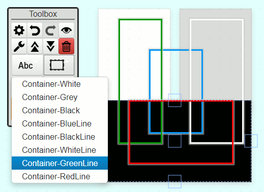
On fig. 9 you can see all the customization we did in this example. Now you’re able to go further! See you for new hints on the next article.